Genuine dilemma over whether to have the main cover as a kind of realistic billboard, complete with overlap marks, or to just have the plain text on a plain white background.
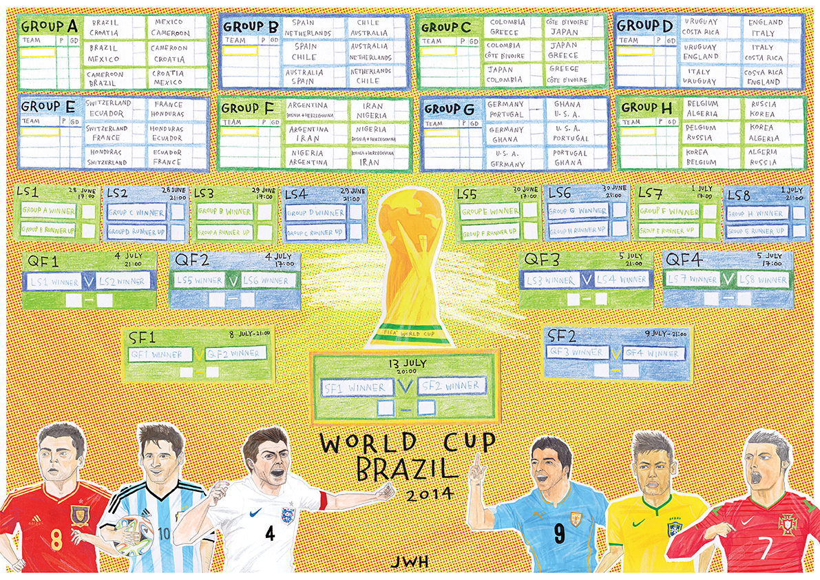
A more recent project now, getting geared up for the Brazil World Cup. This A3 print, produced for The Illustrated Game at Pick Me Up this year, is for sale for a mere £5 (+p&p) Keep up to date with all the games, goals and fixtures, and look at some pretty pictures while you do it! Contact me for more deets. UPDATE: I've decided to put some desktop wallpaper size images up here for free download! Click on the one you want and save as... 1024 x 768 1920 x 1080 1280 x 1024
First couple of finals for a short comic I'm work on with Mr James Reith. Really nice working with a limited palette and line work, and also super cool to see my handwriting in a font! Big shout out to http://www.myscriptfont.com/ which is unbelievably easy to use and looks great too.


i like the first one :) with the realistic billboards, it makes it have a collagey effect :) x
ReplyDeleteSamsies. realistic one is better! :)
ReplyDeleteYup, I like the first one. More juxtaposition an' that :)
ReplyDelete